
Making small yet meaningful changes on your website can impact your website’s conversion rate. Many marketers use lead magnets, email marketing, etc, to attract customers and increase conversion rate. While doing so many marketers overlook the importance of web design in attracting more conversions.
According to an Adobe survey, people like to read something designed beautifully rather than something plain. However, web design is not limited to simply designing a layout but implementing website design conversion optimization principles can enhance conversion rate. According to a report, marketers have only 8 seconds to capture the attention of the visitors and 92.6% of buyers state that a website’s design influences their purchasing decisions. You cannot ignore the web design of the website because 75% of consumers judge brand credibility depending on the website design. In this blog, we’ll learn where we should apply conversion rate and some of the tips to enhance web designs to boost conversion rate!v
What is a good conversion rate?
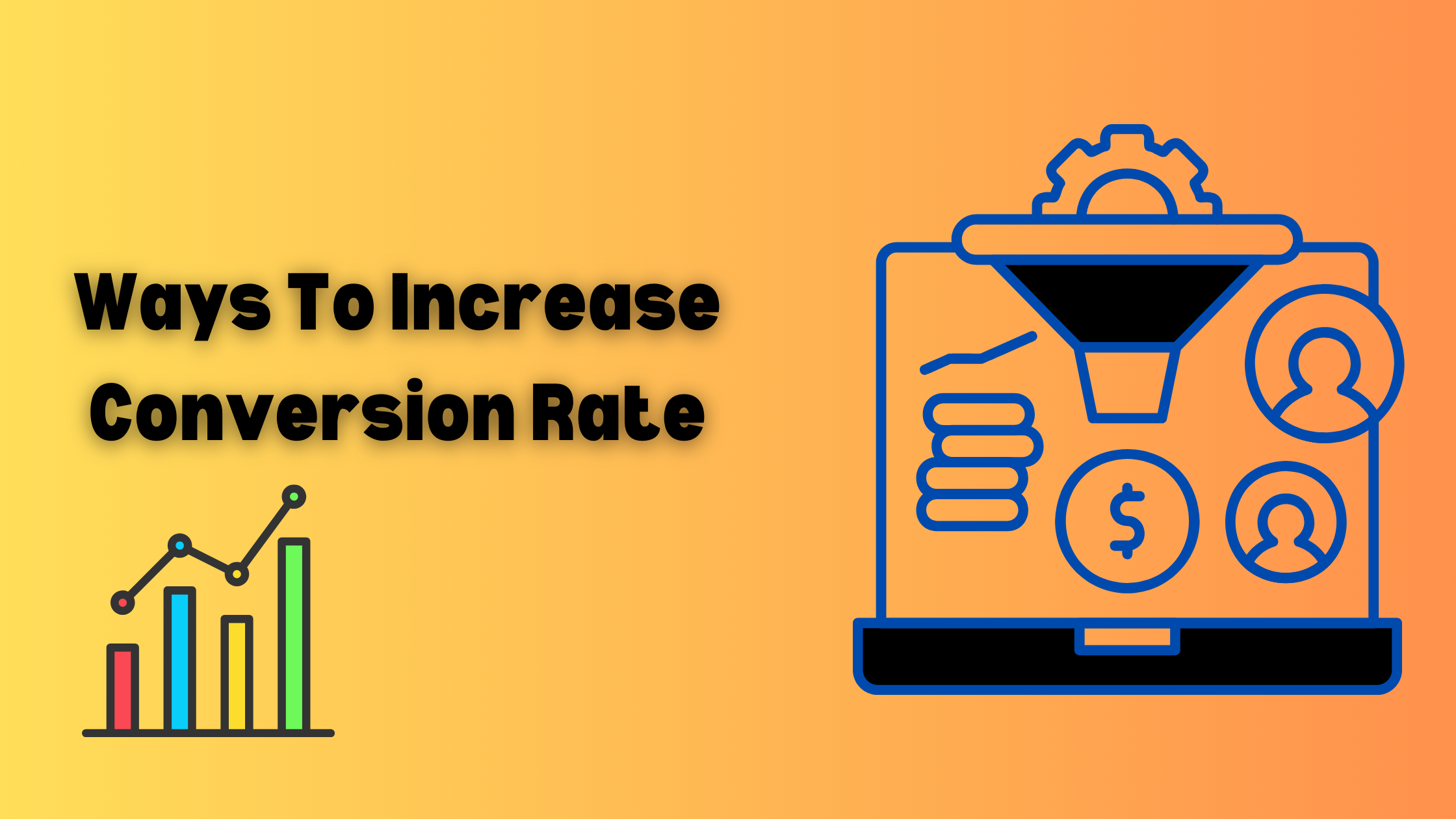
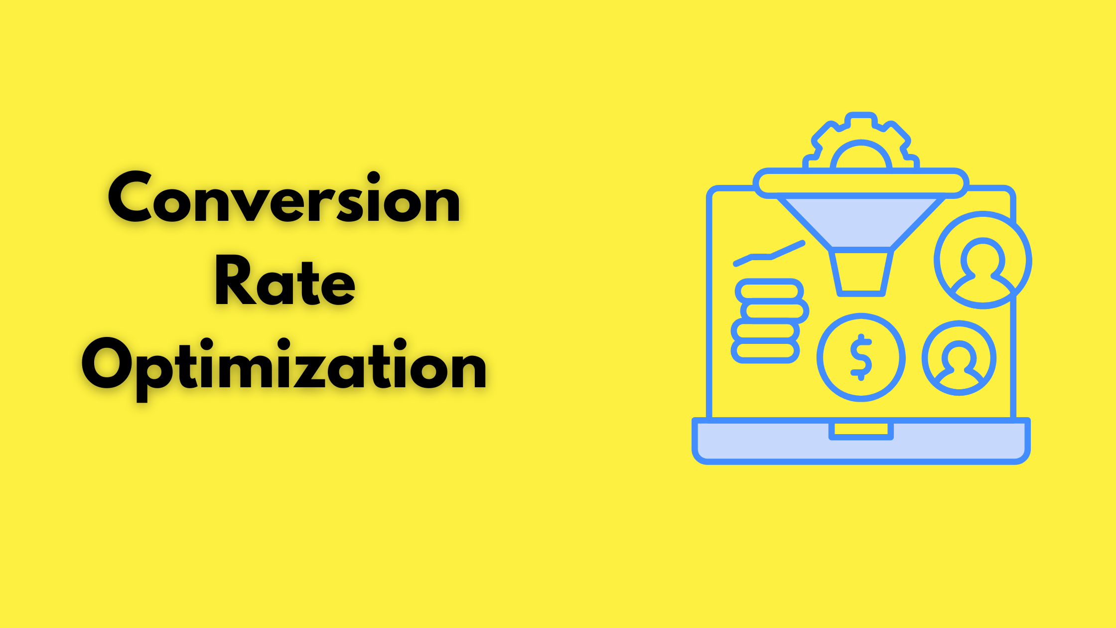
Conversion rate is the percentage of visitors who complete a desired action on your website such as signing up, completing a form, etc. A 2023 survey by Ruler Analytics found that the average conversion rate was 2.9% across 15 industries. While 38% of people stated that they will abandon a website if it is unattractive.
A good conversion rate depends on your industry, niche, audience demographics, etc.
Where should you apply CRO?

These are six areas on your website where you can attract visitors’ attention by making small changes
- Home Page: Homepage is the most important page for attracting visitors and retaining old customers by guiding them further. You can add a signup button on the homepage, add links to your product page, and add a chatbot to enhance the customer experience. For better results, you can try A/B testing on your homepage.
- Pricing Page: CRO helps in converting the users on the product page into a purchasing customer. You can add product features corresponding to its price, add mobile numbers for customers confused about the pricing of the product, etc. Add social proofs on your pricing page for better results.
- Forms: If it is a signup form, contact form, or any form, ensure that your CTAs are well optimized. Use lesser required fields, use clear labels, ask only relevant questions, etc.
- Landing Page: The purpose of the landing page is to motivate people to take the desired action, it is assumed that it would have the highest average conversion rate 23% of all signup forms. A landing page designed for an event can include a video of last year to attract more customers. Similarly, a landing page offering a resource can show preview content to its users.
- Blog: A blog helps in providing useful and helpful content, as well as industry news and updates. You should include a CTA or encourage users to submit their email IDs for getting access to ebooks etc.
- Call-To-Action: Make sure your CTAs are clearly placed, and visible and communicate your message. Bombas updated its CTA from icon to text and it logins increased by 36% which means an increase in 4.1% of orders placed.
Some of the web designs to boost the conversion rate

Here are some of the web design tips that can enhance your conversion rate
- Hick’s Law: Hicks’s law states that the more options you give to users, the more time they take for making a decision. Adding multiple design elements to your website can create a paradox of choice. Give more power to the user that helps in deciding what content and how much they want to consume, such as using a navigation bar or scrolling down the page, etc. Don’t add too many Call To Action buttons.
- The Rule of Thirds: It states that you must divide the image into thirds for better composition. It also states that you must place your main subjects in the left or right third of the entire image and leave the other two-thirds free. You can see its usage on Apple’s website.
- Optimize the speed of the website: Users do not like to wait to load a webpage. According to a study, 1-second delay in page load time can lead to a 7% reduction in conversion rate. Make sure your website speed is well-optimized and maintained. Test it frequently.
- Colors: Use contrasting colors to ensure that items on your website are clearly visible and readable. Make sure the chosen colors align with your brand’s strengths and philosophy. Use a color that helps in evoking the right emotions that your brand wants to evoke.
- F-Layout: It is suggested that an average user follows the F pattern of screen reading. It means that people first look from left to right at the top of the screen. After that, they move to the lower sections. The area that gets the least visibility is the bottom right. Ideally, you should place important CTAs and content across F- shape lines and place less important content in the lower bottom.
Web designs play an important role in determining the conversion rate. Lumia 360 has designed effective and well-performing web designs for its clients that have increased their conversion rate. We have incorporated strategies like effective use of negative space, following Gestalt principles, use high-quality images and videos to attract new customers and retain existing customers. A good conversion rate is a sign of a successful website and business.
Read Also: Navigating The World of Google Analytics: how to optimize local SEO
Read Also: Future Of Web Design: Preparing For The Future Trends













































2 Comments
[…] 10 ways to increase the conversion rate of a business. All you need to do is to optimize your web design for conversion. Implement the above-given tactics to increase the conversion rate. For more […]
[…] Read Also: Web Design for Conversion Rate Optimization […]