


Over the last few years, the landscape for e-commerce has evolved, with mobile commerce becoming the most prominent in present times.
The number of mobile users has increased over the years, as of 2024 there are approximately 7.21 billion smartphone users and as a result, the number of purchases made from mobile has also increased. According to a report, mobile shopping is the number one driving force of global e-commerce growth.
This shift highlights the changing nature of the consumers and the potential and importance of optimizing e-commerce. In this blog, we’ll learn mobile optimization, its key elements, and best practices!
What is Mobile Optimization
Mobile Optimization is the process of adapting and designing websites, and online content to ensure functionality and usability on mobile devices. This optimization includes creating responsive designs, adjusting content and layout to fit smaller screens or devices, optimizing loading time, and applying mobile-friendly navigation. The aim is to provide a smooth user experience. This helps in improving the engagement rate and enhancing performance.
To stay relevant in the industry, companies practice mobile optimization techniques. Mobile optimization helps in attaining higher search engine ranking, conversion rate, and cross-device consistency. It also helps in improving SEO, enhancing brand image, reducing bounce rate, and being cost-effective. It also helps in improving accessibility and enhancing mobile traffic.
A website that is optimized for mobile simplifies the purchasing and browsing process. According to a report, mobile-optimized websites have a higher conversion rate than non-mobile-optimized websites. Also in today’s competitive atmosphere, customers switch between multiple devices during their purchasing process. They can begin a journey on one device and end on another, for this reason, mobile optimization is very important for brands. It also helps in building a strong brand image as a well-designed website reflects professionalism. It is a cost-effective way for businesses to achieve their business goals and build a strong presence. It also enhances the accessibility of websites for people with disabilities. It has features like voice-activated search and screen readers which enhances the accessibility of the website.
Key elements of mobile optimizing

Here are some of the important key elements of mobile optimization.
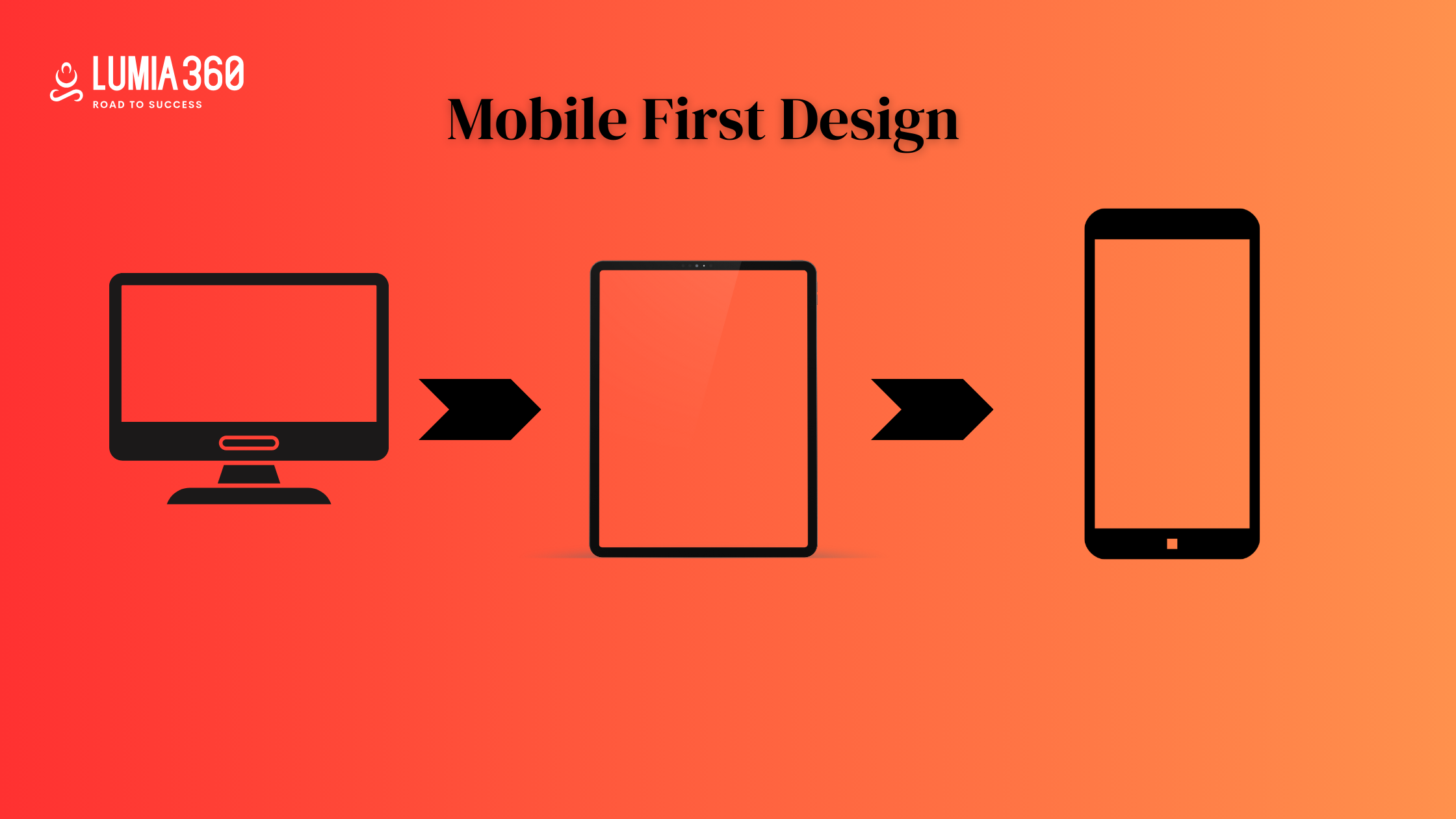
- Responsive Design: It is the foundation of any mobile-optimized e-commerce website. It makes sure that the website’s layout adjusts to fit the smaller screen of the device. Irrespective of the device used, mobile phone, tablet, desktop, etc the shopping experience remains smooth.
- Touch-Friendly Interface: Mobile users interact on your website using touch so your platform must be touch-friendly. It means having buttons and links that are easy to tap and sufficient space between them to avoid accidental or multiple clicks at one time. You should test your e-commerce website on several devices to ensure the efficient working of the buttons.
- Optimize Media: Using high-quality images of your products is very important but make sure it doesn’t hamper your loading speed. Mobile optimization compresses your image and uses modern formats to reduce the size of your image without sacrificing its quality.
- Navigation: Mobile users should quickly and easily find what they are looking for. Simplified navigation with a clear menu, well-defined categories, and an easy-to-use search box can create a smooth shopping experience. Mobile optimization also involves reducing the number of clicks needed to reach important and key pages.
Best Practices for Mobile Optimization in E-commerce

According to a report, 57% of users said that they would not recommend a business with poorly designed websites on a mobile device. To ensure a seamless experience and fulfill your marketing objectives. Follow these practices for mobile optimization in e-commerce.
- Responsive Design: Create a design that adjusts to all screen sizes and resolutions. Which ensures a seamless viewing experience for everyone.
- Navigation: Use simple and easy-to-use navigation with clear menus and dropdowns so that users can easily browse through your e-commerce platform.
- Streamlined Design: Remove all the unnecessary and unimportant clutter from your website’s design. A clear and clean layout ensures mobile viewing.
- Video Optimization: Optimize media files to enhance loading speed, which helps in better search engine ranking.
- Text-to-Image Ratio: Create a balance between text and images. Focus on improving the readability. Choose the appropriate font size, effective use of white space, correct spacing, etc.
- Page Load Time: Reduce page loading time by optimizing codes, compressing files, and limiting the use of heavy multimedia files.
- Mobile-Friendly Form: Create forms that are optimized for mobile devices that feature clear instructions, user-friendly input fields, etc.
- Easy Checkout: Create a smooth and easy checkout process for mobile users to reduce cart abandonment and increase conversion rate.
- Speed: Make sure the speed of the platform is fast to fulfill user’s expectations and reduce bounce rates.
- Cross-Device Testing: Keep testing your e-commerce website across different devices to identify and solve compatibility issues and ensure a consistent user experience.
- Voice Search Optimization: Adapt your website for voice search optimization to improve search engine ranking. It also helps in attracting users who have used voice assistance.
- Compatibility Issue: Make sure your e-commerce platform is compatible with all devices such as mobile, tablet, iPad, etc, and across all browsers such as Windows, iOS, Android, etc.
In today’s time, optimizing e-commerce platforms is very important for staying relevant in the market. E-commerce optimized for mobile not only ranks well on search engines but also ensures a smooth user experience. Brands use user-friendly mobile designs and targeted advertising to maximize the benefits of mobile optimization. Stil,l lost about mobile optimization? Lumia 360 can help you in optimizing your e-commerce for mobile devices. We have designed multiple designs that are responsive, and engaging and result in high ROI.
Read Also: How to Design a Product Page
Read Also: Tips To Manage Social Media Crisis


