The use of the color black in website layouts has always been an eye-catching trend. Modern, elegant, sleek, bold, black websites reflect style and sophistication.
Using black has many pros and cons in this blog, we’ll learn what is the dark mode, when and where not to use dark mode, and tips for designing dark mode.
What is the dark mode and its benefits?
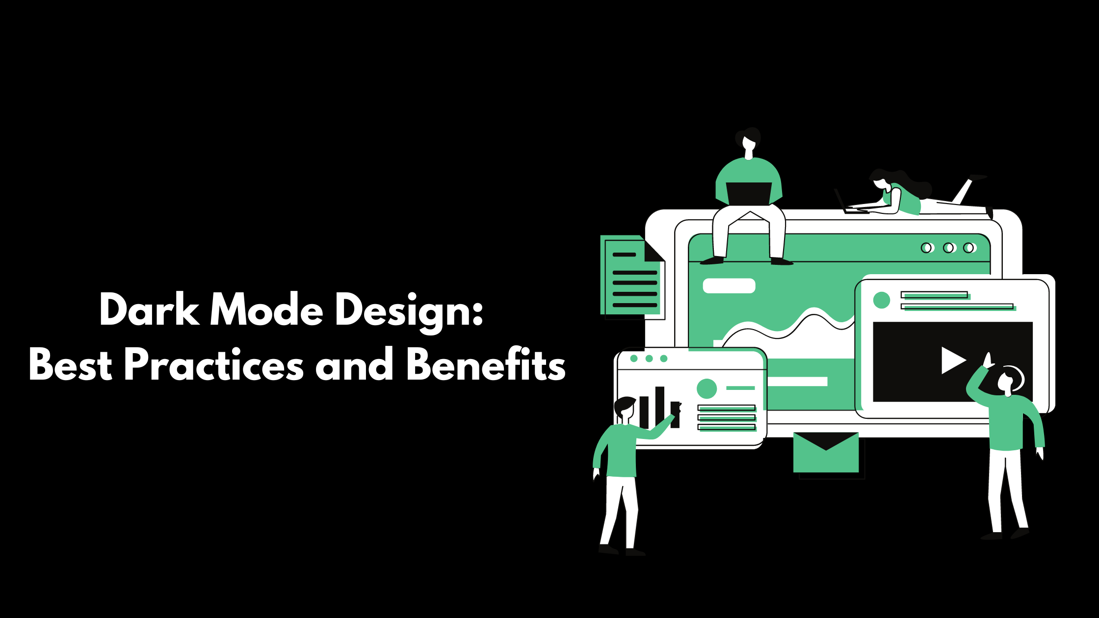
Dark mode is a display setting where you use black color as the background and light color text. This design has many benefits such as it conveys a sense of modernity and elegance. The black background against white text makes the content and brand stand out. Black color as a background also enhances the visual impact of images and graphics. Black color evokes many emotions from curiosity, royalty, etc. Black color also never goes out of style and comfort, it suits well with every Industry. Black design is used effectively in minimalist design.
The disadvantage of dark mode is that it causes readability issues. Sometimes the black background makes it difficult for the users to read the content. Also, the color black has many limitations, hence it can’t be used by every Industry for example brands that have a friendly vibe may appear rude to users. Also if it’s not balanced equally, a black website might seem too heavy.
When and when not to use dark mode

You can use black mode when
- You want to emphasize something important: Black design works well when you want to highlight an element of your website or it works well on visual elements as it helps in making it stand out. It also helps in building a visual hierarchy.
- Enhance usability: If your website is used mostly at night, then this mode is ideal for you as it enhances user experience and usability. For these reasons, many streaming platforms such as Netflix and Prime have black backgrounds.
- Emotional branding: Empty spaces are essential for building black mode. Otherwise, it may look overcrowded. Black color evokes more powerful and strong emotions as compared to light colors. Black color is associated with royalty, power, elegance, etc.
When not to use black color
- When you have too much written text: Don’t use dark background against white text as it makes it difficult to read it.
- Lots of elements: If your website has many small buttons, images, graphics, etc then avoid using black color. It might make the website look overcrowded and cluttered.
- Many bright colors: Black or dark mode limit the color option.
Tips for Designing

Here are some of the tips on how you should ideally use dark mode to enhance your website
- Go beyond black: The dark theme doesn’t necessarily mean using pure black color. To make the website look a bit unique you can use different shades of dark colors such as grey. The impact of other dark colors is also similar. The grey color also enhances the readability of the text.
- Contrast: Have a fair balance between your colors. Against a dark background, you must use white color text for better readability. An uneven background may hamper your website performance and look. You can add a visual element to your dark design to break the large black space and make your overall design interesting.
- Dimensions: In dark mode shadows aren’t created naturally unlike it is created naturally against a white or light background. To add a dimension, you must add lighter-shaded elements and visual cues to add depth to your design.
- Testing: Ensure that your dark design looks good on every screen size and device. Screen size, resolution, and brightness settings affect how users will perceive the website. Also before applying this design conduct various tests to ensure it meets the accessibility standards.
- Readability: Make sure you choose the correct text size and font on a dark background to enhance the readability of your content. Select the correct contrast so that it does not cause an eye strain.
Many brands such as Apple AirPods Pro, Estudio, etc use dark mode for their websites. It helps in positioning the brand as modern and elegant. Also, it helps in highlighting their products and services. It provides a special emphasis on them. Lumia 360 has a team of experts who excel in creating web design. We have created websites for many brands, which have improved their search engine ranking and overall user experience. Know more about our web designing process by sending us an email at info@lumia360.com or call us at 514-668-5599.
Read Also: Web Design for Conversion Rate Optimization
Read Also: The Role of Review Management in Customer Experience


