


The world of design and websites is evolving. But one factor that has always been important and will remain to be important is visual hierarchy. It is important for websites, product packaging, advertising, etc. It’s a way of arranging the elements of the website in a way that places elements of the website on the basis of their importance so that it captures audience’s attention and motivates them to perform a certain action. In this blog, we’ll explore what are the key elements of visual hierarchy, how to apply it to your website, and why it is important for your website.
What is visual Hierarchy?
Visual hierarchy is a way of placing the elements or content of the website on the basis of its importance. Designers use size, style, contrast, proximity etc to create a visual hierarchy that guides the audience. They grasp the information efficiently and are motivated to perform certain tasks.
What are the key elements of visual hierarchy?
The principles of visual hierarchy are:
- Size: Size plays an important role in establishing a visual hierarchy. The larger size content is assumed to be the most important that should grab the attention of the audience.
- Color: Color is used to create contrast. This creates a sense of differentiation between various elements and draws attention to specific elements that you want your audience to look at. Bright colors can highlight a piece of content.
- Font: Font style plays a crucial role in highlighting the important content. The headlines are usually written in larger font sizes. Similarly, font style also creates an impact in the mind of the audience. Explore the role of typography in web design.
- Rule of Space: Don’t overload your website with content, use white space or negative space in your website. It makes your website look clear, user-friendly, and well-organized.
- F-Pattern and Z-Pattern: F-Pattern attracts most eye movement patterns in English readers. F-Pattern refers to placing the text from left to right. This pattern is used mostly in images to attract the attention of the audience and to make sure that they understand your information. Similarly, Z-Pattern is used commonly in images. Using images on your website is a great way to provide information as the brain grasps images more than texts
- Proximity: It refers to the process of placing the similar content together. It helps in better engagement, it encourages the users to consume more content on your website.
- Perspective: Use the principle of perspective in your designs. This creates a sense of depth to your designs making the design more attractive and eye-catching.
- Alignment: This is the process of organizing the elements of the website so that there is a uniform order in the website. This helps the users better consume your content.
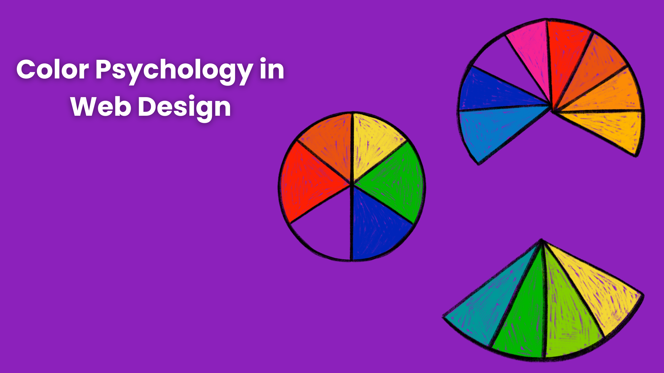
- Repetition: Repetition creates unity so that you understand they belong to the same website and the brand. Using similar colors for your brand can create a sense of recognition in the audience’s mind. If you’re confused about how to select the colors for your website then understand the color psychology.
- Odd-Numbered Groups: To allow you to draw special attention to one image by placing it in the center and adding the same amount of images on either side of the image. By doing so the picture in the center gets the attention of the users.
- Texture: It is generally the background of the website. Use a texture that resembles your brand’s voice and tone.
- Grid: Most impactful designs are created by using a grid.
How to implement a visual hierarchy in your website?
Now that you have learned the principles of visual hierarchy, let’s learn how to implement or build an effective visual hierarchy strategy for your website
- Audience: the first step in creating a visual hierarchy is to understand how your audience perceives content, their preferences, etc.
- Select the principles you want to use: Consider all the elements that are important for your website such as call to action, images, tagline, etc. You should select those principles that will highlight your important content and motivate them to perform specified actions.
- Experiment: Once you have selected the element of your website and the principles you will apply to it, try to experiment with some principles as well. To see which principle makes content more attractive and captures user attention. It is similar to a/b testing.
- Apply variations in hue and saturation: Colors can arouse a particular emotion in the users. Applying variations in hue and saturation changes the color of your website by making it lighter or darker. You can choose the one that suits your brand more and fulfill your objective.
- Use of white space: Don’t clutter your website with large amounts of content. Use white space in your website to provide more clarity and make it user-friendly.
- Positioning: Positioning will help you in understanding how different content will be perceived by the users. Place the important elements above the fold.
- Test and adapt: Test your design before publishing it. Try to gather reviews and feedback from your audience. Adapt to those suggestions and feedback in your style.
Why is it important for your website
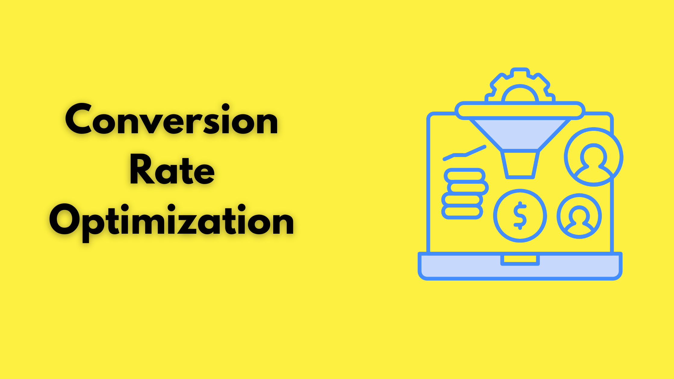
Visual Hierarchy is important for the website as it helps in communicating your message and information more clearly to the audience. By applying visual hierarchy you guide the user throughout your website. It helps in capturing the audience’s attention, better engagement and understanding of the content. It encourages the audience to spend more time on your website and perform a specific action. It helps in fulfilling your goals. It helps in evoking emotions in users and monitors user behavior. It improves readability, and understandability and makes your website more attractive. It enhances user experience and boosts conversion.
Conclusion
By now we have learned the principles of visual hierarchy and the effective strategy to implement a visual hierarchy in your website. Visual hierarchy influences your user engagement, influences user attention and perception, improves readability, monitors user flow, determines your brand’s perception, and increases conversion. If you apply the principles of visual hierarchy effectively your user experience improves driving more ROI. It guides the users through your website. Apply color, font, size, positioning, texture, grid, etc to enhance the visual hierarchy of your website.
We at Lumia 360 are here to help you. We have a team of experienced and well-trained designers. Our six-step web designing process will create an engaging and responsive website. We’ll make sure your website has all the necessary elements, trends, and visual hierarchy in your website. To know more about our services email us at info@lumia360.com or call us at 514-668-5599.
Read Also: Web Design Trends to Watch in 2024
Read Also: Explore the role of typography in web design


1 Comment
[…] Read Also: The Art of Visual Hierarchy: Design Principles for Guiding User Attention […]