

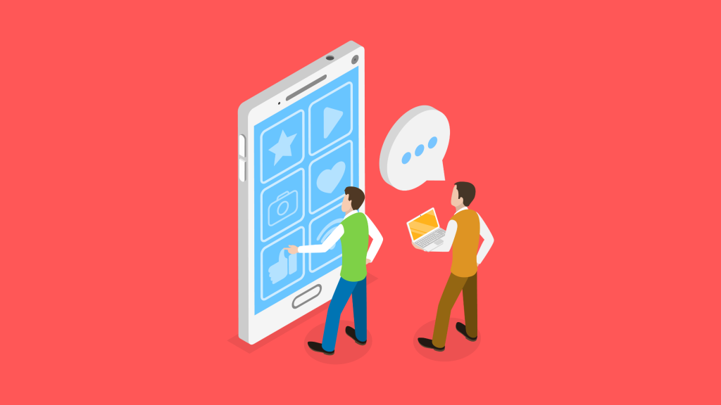
Mobile-first design enables web designers to design for mobile first. Mobile-first design enables web designers to design for mobile first. According to Statista, half of web traffic is generated by mobile. This shift has influenced web designers and marketers to focus more on mobile optimization and mobile marketing. In this blog, we’ll explore what is Mobile first design, its benefits, best practices, and much more!
Why Mobile First design
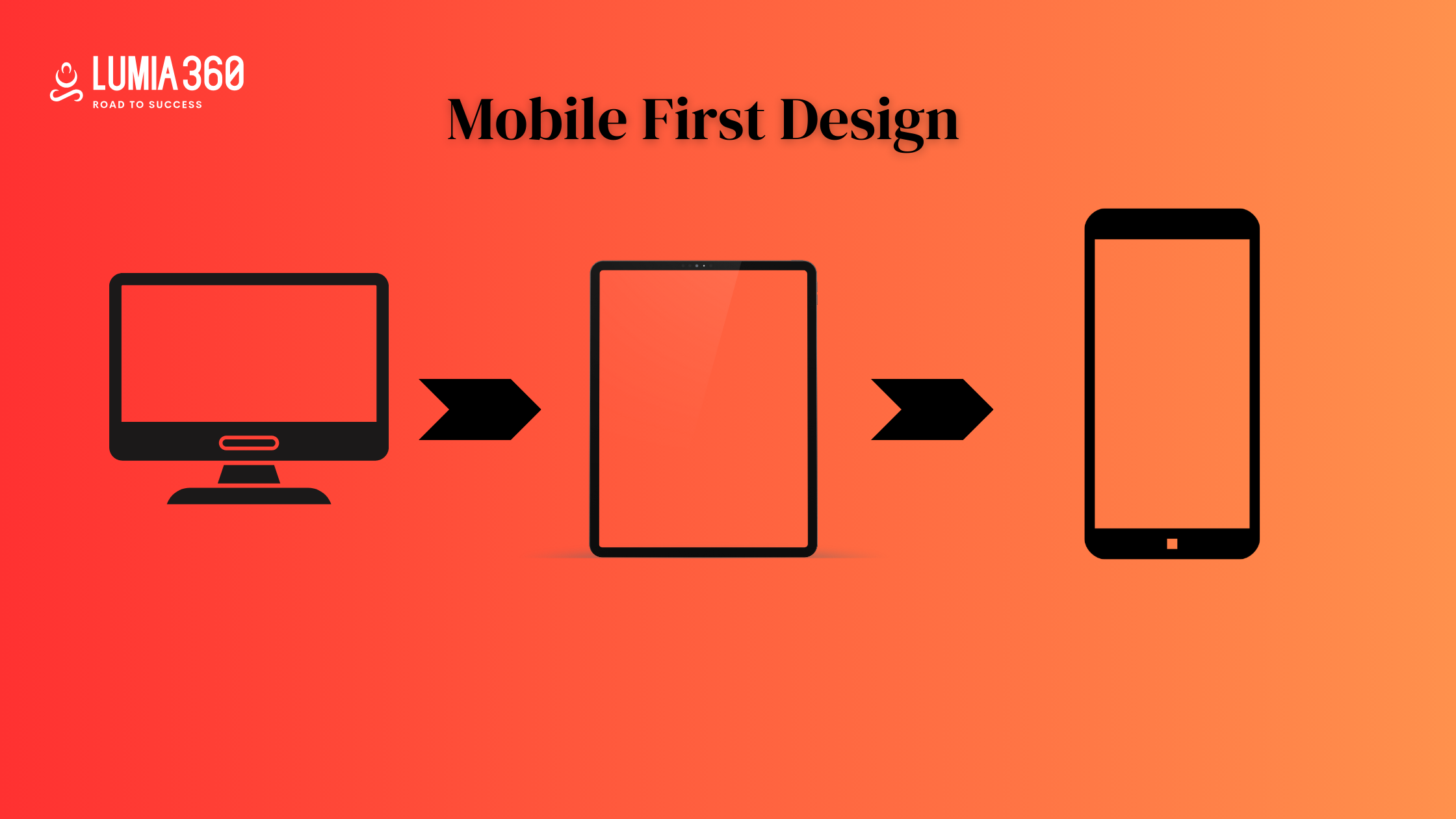
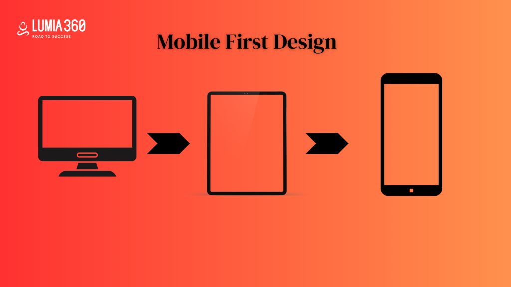
Traditionally web designers used to create websites for desktop first and for the mobile or small screen. But now with the advent of mobile technology, web designers first create websites for the mobile and then for the desktop. The optimization of mobile web pages is the top priority.
Mobile First Design strategy follows several design processes such as prototyping the web design layout for the small screen first and then for the larger screen. This ensures that the web layout is correct for the given screen size.
This approach considers the constraints and capabilities of mobile devices while designing a website. Web designers aim to create a better user experience, touch interface, and fast page loading speed for mobile websites first and then for larger screens.
Consider these points while implementing a Mobile First Design
- User Experience: Try to fulfill the needs and wants of your users. Try to understand how they consume your content and what are the intended actions. Based on this information try to enhance user experience.
- Design for small screen first: Once you understand the needs and wants of your users. Create the design for your website. Optimize the content and features of your website for the small screen.
- Responsive design: A responsive web design adjusts to all screen sizes. Focus on creating a design that looks good on all the screens.
- Test Content on various devices: Test your website on various devices so that you can fix the errors.
- Check feedback: Ultimately you are designing the website for the users. Reading their feedback allows you to improve your website and incorporate their suggestions.

Benefits
Here are some of the benefits of Mobile First Design
- Mobile Traffic & conversion: With an increase in the number of mobile users, if you create a mobile-first design then chances are that your website will gain more traffic & conversions.
- Better UI and UX design: If your target audience is mobile users. Then enhancing their user experience is a must. Mobile-first design enhances user experience. Also mobile-first website helps you in creating a content-driven website. Attention is paid to smaller details as well such as fonts, colors, and other sources to enhance the look of the website.
- Cost and time-efficient: Creating multiple websites for different screen sizes is hectic. Creating and maintaining one version of the website is cost and time-efficient.
- Website load speed: Mobile designs generally produce lighter web pages and applications and load faster than desktop websites.
- Reduce bounce rate: The bounce rate is less compared to desktop websites.
- Data-driven decision-making: You can take into consideration all the feedback and data that you have collected in the first phase of web designing.
- Adaptability: Mobile-first design adapts to the new changes more easily.
Best Practices
- Visual Hierarchy & clear CTAs: Arrange the elements of your website in a hierarchical order of importance. Most important to less important. Have clear CTAs.
- Size of web elements: To create an optimized website, you should create or use the appropriate size of image, font, buttons, etc.
- Wireframes: Creating Wireframes speeds up the coding process as there is a wireframe guide provided for web designers to follow or seek help from.
- Mobile navigation: Easy navigation enhances user experience. Make sure navigating from one page to another from your website is clear and easy.
- Testing: Test your website on different devices so that you fix all the errors and make sure that all elements are working and your website is looking attractive.
- Easy to Contact: Provide your correct information to the users. This information should be easy to find. You should create a Contact Us Page.
- Avoid Pop-Ups: Avoid unnecessary Pop-Ups as they can annoy or distract the users. Hampering their user experience. Your focus should be on the user’s needs and wants.
- Optimize content & images: Make sure your content and images are optimized for the mobile screens.
- Thumb-friendly touch: Ensure that the touch interactive elements and buttons are accessible and can be used easily with the thumb. Include thumb-enabled buttons.
Key Considerations for Mobile First Design
- Focus on core functionality: The size of the screen is limited so make sure your important elements and content are on the top. The content that users want or demand should be your top priority. It should be accessible on the mobile interface.
- Streamline navigation: Make sure the navigation is clear and simple. Finding a solution to their problems should be easy. Use the Hamburger menu, tab bar, etc to keep navigation uncluttered and clear.
- Responsive & flexible layout: Use responsive design so that your interface adapts to all devices. Fluid layout and flexible grids allow content to adjust dynamically.
- Fast Load Speed: Minimise HTTPS requests and use caching techniques to improve load time.
- Optimized content: Optimise the content of the webpage. Write small sentences and scannable text. Write relevant content and use statistics or bullet points in your text. Add alt text for images.
Conclusion
Opting for a Mobile First design is no longer a use but a necessity. By understanding the challenges and opportunities of mobile devices, designers can create attractive and engaging mobile interfaces. By improving the navigation, content, CTAs, thumb-friendly touch, fast load speed, mobile-first prototyping, etc you can improve the performance of your mobile website. Let’s explore the world of the mobile first design and focus on the small screen first.
READ ALSO: Navigating the World of Influencer Marketing
READ ALSO: Building a Positive Online Reputation


