In today’s time, minimalist design is not just limited to making the website more attractive but also enhances its effectiveness and performance. Your website creates the first impression amongst your customers. This is the reason why you should enhance your website especially when the competition for grabbing attention is high.
One of the ways to stand out from your competitors is to make your website more attractive and engaging. In this fast-paced world, simplicity holds a great power. Minimalist design is very effective and popular because it’s clean, effective, and enhances web aesthetics.
In this article, we will learn why minimalist design is important, its power, and the best practices to enhance your minimalist design
What is Minimalist Design?
Minimalist design highlights simplicity, cleanliness, and clarity in web design by avoiding unnecessary clutter or factors. Important and useful content is highlighted in minimalist design. Also, it promotes functionality. When a website gives attention to clean aesthetics, consistent user experience, and simple navigation, minimalist design improves engagement, SEO, and brand reputation. Eventually, it increases the sale of your business.
Minimalist design creates a web experience that is clean, simple, and effective. In this design, web designers avoid or eliminate unnecessary factors such as images, text, animations, etc. Special emphasis is placed on white spaces, which creates a sense of balance and harmony on the web page. To improve user experience use a usability test so that your design becomes more effective and efficient.
Power of Minimalist Design

Minimalist design holds significant power in making your website stand out from your competitors and enhancing your website traffic and sales of your business. Here are some of the reasons why minimalist design is more effective and efficient.
- Timeless Design: Minimalist design creates timeless aesthetics that are suitable for all trends and times. It ensures that your website is relevant and remains visually attractive at all times and ensures your visitors have a good impression of your website.
- SEO: Minimalist design ensures that your SEO is enhanced. Google gives a high rank to websites that load fast and provide a smooth user experience. The minimalist design optimizes your SEO so that your visibility and organic traffic increase.
- Conversion rate: Minimalist design guides users well and aids them in performing certain tasks. Which increases the conversion rate.
- Mobile responsive: Minimalist design adapts easily to various screen sizes and resolutions. Minimalist design focuses more on simplicity and clarity thus ensuring that users have a seamless experience. Mobile-optimized websites increase conversion rate.
- Fast loading speed: Minimalist design has few elements, reducing the page load time. A well-optimized website should ideally load in three seconds. This ensures that users have a smooth experience and helps in engaging your users.
- Simplicity: Minimalist designs focus on simplicity, wherein only important content is highlighted and unnecessary elements are eliminated. Users engage better with your content and grasp important information in the first few seconds. It also aids users well in navigation making the navigation process smooth.
- Brand reputation: A minimalist design showcases how attention is given to small details. Also, it shows professionalism. This professionalism creates a positive image of the brand. Especially if you use consistent branding elements and aesthetics then it establishes credibility and trust in your customers and establishes brand authenticity.
- Engagement: According to a study, 72% of customers form an opinion or judgment about the credibility of the brand by looking at its website design. Minimalist design uses clean and attractive elements to attract customers. They are likely to spend more time on your website.
- User experience: Minimalist design ensures a smooth user experience by making the navigation process easy, improving loading speed, and helping in better grasping of the information. The interfaces guide and help users browse the website. All this leads to a seamless experience and better engagement.
- UI/UX: Minimalist designs are user-friendly, wherein unnecessary graphics, text, buttons, etc are ignored. A complex or overcrowded website tends to confuse the user by providing ample amounts of information. Hence s simple, clear UI/UX design is essential for a smooth user experience.
- Content: Too much information can confuse the user and can bore them. Providing relevant and important information should be your goal. A simple, short content is easy to understand and remember. Users prefer such short and simple content. This short and simple content tends to attract the attention of the user and try to invoke emotions in them. The aim is to provide solutions or educate the user with necessary information rather than overloading them with irrelevant information.
- Attention and focus: Minimalist design ensures that all the relevant and necessary information is presented to the user. A lot of attention and focus is diverted to the smaller details. From selecting the font size to the color scheme every decision is taken with complete determination. The focus is to provide a seamless user experience and ensure brand consistency and beautiful aesthetics.
Tips to enhance minimalist design

Minimalist design contains few elements, some of its elements are color scheme, typography, use of space, visual hierarchy, CTA, loading speed, etc.
Here are some of the tips to enhance your minimalist design
- Visuals: Visuals are necessary for creating a good and impressive first impression. It is assumed that a user makes an aesthetic-driven first impression of a website in the first 50 milliseconds. More than the quality of content, the quality of visual elements matters more in creating a good first impression.
- Perception of experience: The first impression is usually considered to be so strong that users can recall beautiful and attractive designs as easy to use irrespective of some usability issue.
- Aesthetic establishes brand identity: Similarly, when the branding or designing elements are used consistently, it establishes brand identity and credibility.
- Design principles: There are many visual design attributes and elements that decide whether a design is aesthetically appealing or not. You must have a clear goal and objectives and accordingly, you can select a design principle. It must be aligned with your brand and fulfill your objectives.
- Avoid unnecessary information: Use that content has high information value such as content that is relevant, high-resolution images, significant cta, etc. Avoid information that has low information value such as irrelevant information, poor quality image, or anything that seems to be an extra without any purpose. Don’t overuse font/color variations; it can hamper the understanding or clarity of your content.
- Universal visual pattern: You can analyze your competitor’s websites etc to study the pattern. Or you can follow the universal visual pattern that is designed and colors that are liked and preferred by everyone in general irrespective of the culture or background.
- Color scheme: Selecting the right color scheme is very crucial in minimalist design. This chosen color will represent your brand identity and ideology. These colors evoke specific emotions in the users and convey your brand message. So it is important to select colors that align with your brand identity. Make sure you don’t select more than three colors.
- Negative space: A minimalist design consists of white space or negative space which creates balance on the page. These spaces ensure that important content is highlighted. These spaces are the backbone of the design and make the minimalist design visually appealing. It removes all distractions, builds visual hierarchy, and ensures a smooth user experience. For example, Airbnb uses a minimalist design layout which is easy to use and understand. Its navigation process is easy and quick.
- Typography: Typography is also responsible for making your website aesthetically pleasing. Choosing the correct typography or combination of it is important as it not only makes your design attractive but is also responsible for creating a visual hierarchy. Also, your font should be usable and readable on various screen sizes. Usually, minimalist designs prefer sans serif fonts as they look more clear and simple. At the same time, font size matters equally. However, font size, style, and content length should be aligned to each other so that it doesn’t look overcrowded or forced.
- Website layout: Make sure you place the elements and content of the website in an aligned manner so that the navigation process is simple and easy to use. For example, a grid layout can be used in a minimalist design. This will help in creating a balance in the website. for example, Apple uses a clean layout wherein they avoid using distractive elements in their minimalist design. It ensures that users’ attention is on relevant and important information.
- Content: Use only the relevant content that you feel matters to the user. Also, add only those elements that are required and keep your website free from distraction. The placement of the content is also important, placing the important information at the top. Use high-resolution images that convey some meaning to the users. At the same time placement of the images is equally important, many websites place the image in large size in the background as it creates a sense of originality. Also use images that are visually attractive, bright, and meaningful. Your content should be optimized for various screen sizes. For example, Nike has a beautiful minimalist design wherein relevant information is highlighted and it provides a smooth shopping experience to users.
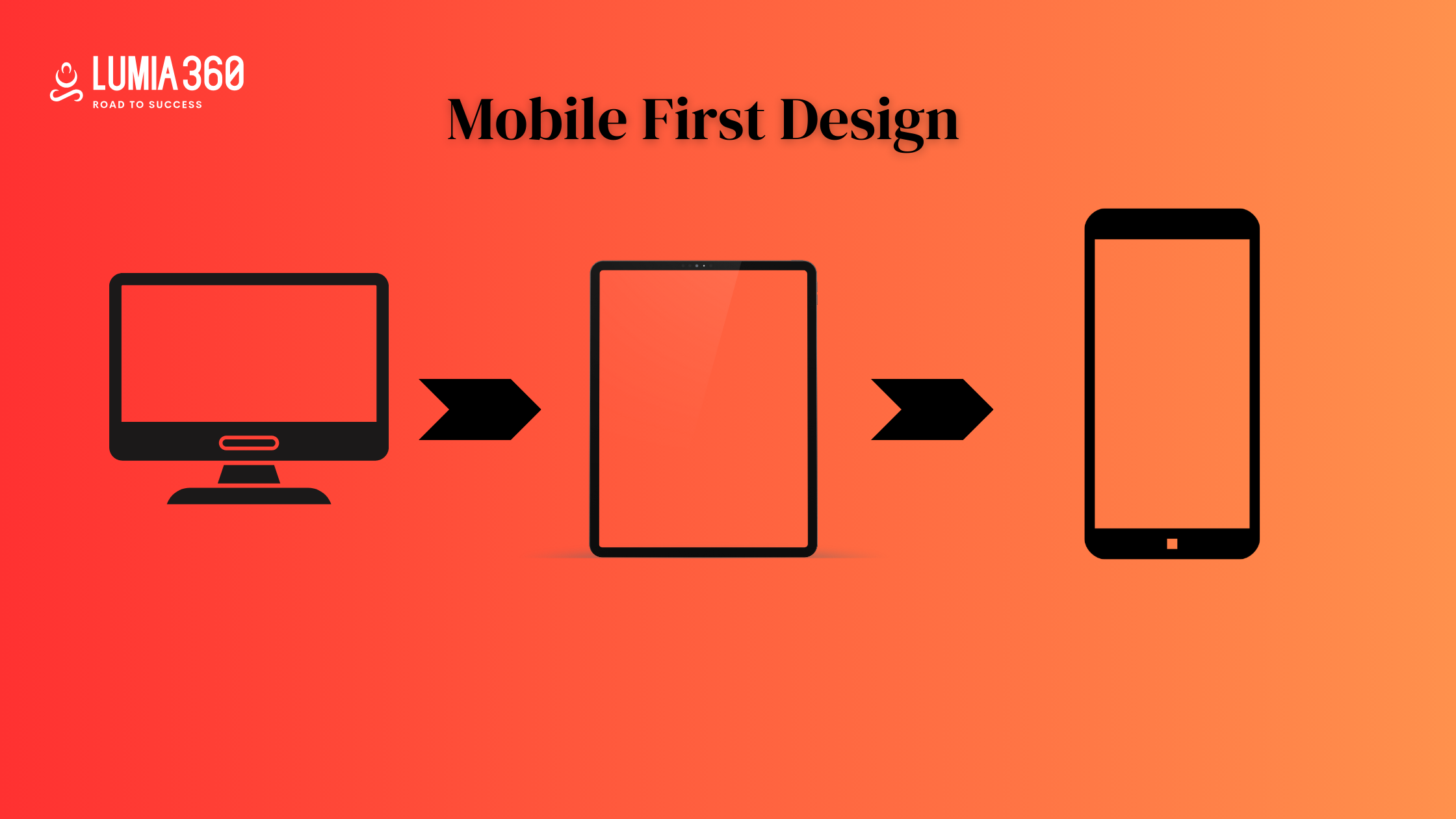
- Mobile responsive design: Ensure that your design loads faster on the mobile device and your content is well optimized for the mobile screens. It should create the same effect or impact that it makes on a larger screen. According to a study, 53% of users abandon mobile sites that take more than three seconds to load. Hence try to optimize your mobile loading speed.
Minimalist design will remain relevant at all times. Having a minimalist design ensures that your website is easy to use, and aesthetically pleasing, increases engagement and conversion rate, and eventually increases your sales. It ensures a smooth user experience. A well-designed minimalist design is aimed at solving many User experience problems. If you crack this design method, then definitely your online traffic will increase and the bounce rate will be reduced. However creating an aesthetically attractive minimalist website is not easy, you must have a proper understanding of different elements of website design. Lumia 360 has expertise in creating visually appealing minimalist websites that have yielded positive results for our clients. It has generated leads and improved their search engine rankings. We consider the typography, color psychology, your business goals, etc to design a website that is well-designed and responsive. We cater to small and medium enterprises and our team consists of designers who have experience in the industry. To know more about web designing services, email us at info@lumia360.com or call us at 514-668-5599.
Read Also: How to create viral ad taglines and slogans
Read Also: Podcast Trends for 2024

















































2 Comments
[…] Use contrasting colors and an ideal font so that users can read the information. Follow a minimalist design technique. Also, create high-quality […]
[…] Read Also: Minimalist Design: The Power of Simplicity in Web Aesthetics […]