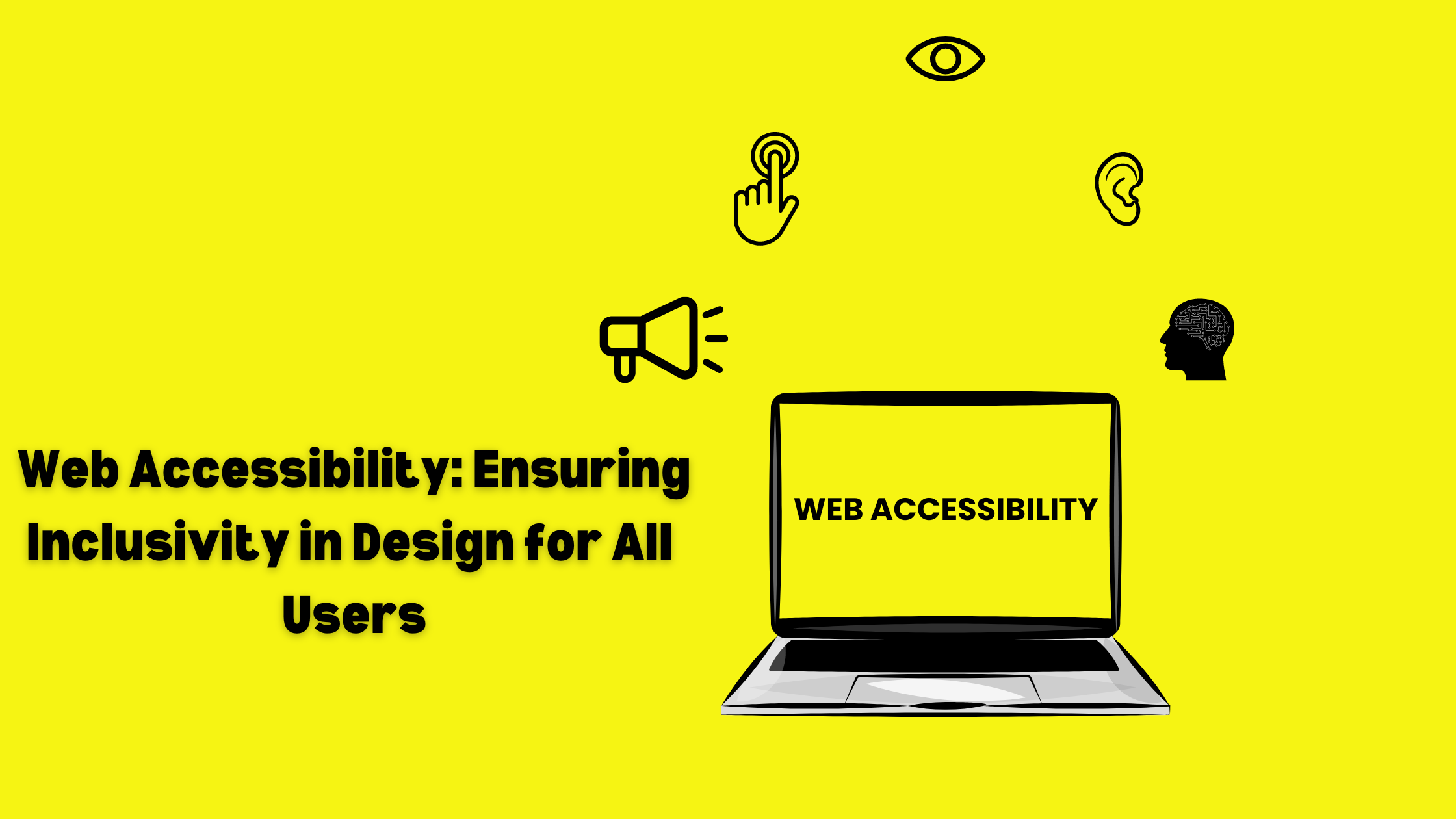
In today’s digital world, every user must access websites equally. Accessibility in web design means that every user can access the website even those with some disabilities. Every user has a smooth user experience and navigates and interacts with the website.
In this blog, we will learn why accessibility is important in web design, and the challenges of accessibility. Also, we’ll learn some tips to enhance accessibility in web design!
Why is Accessibility important in Web Design?
Accessibility in web design simply means that all users irrespective of their disabilities can navigate, understand, and interact with the website comfortably and smoothly. Focusing on accessibility improves the user’s overall experience and enables global accessibility. To achieve this, web designers must follow Web Content Accessibility Guidelines (WCAG) and several steps like adding alt text to images so that screen readers can describe the content of the image to those with visual impairments. You can enable keyboard navigation for users who can’t use a mouse. Also, you can add captions and transcripts for audio content to help users with auditory impairments. For people with color blindness, you can add highly contrasting colors to make text and other elements readable to them.
Accessibility is crucial for your business as it helps increase your visibility, provides equal access to all users, helps enhance usability, is cost-friendly, and enhances search engine ranking. Higher educational institutions are bound by federal and state laws to ensure web accessibility. Non-compliance with it will lead to legal consequences. Beyond legal obligation, accessibility also empowers people with disabilities so that they can participate equally in society, it is the moral duty of every citizen. However accessibility is not limited to people with disabilities sometimes everyone requires enhanced accessibility such as reading captions in noisy environments, adjusting screen brightness, etc.
Accessibility also improves web traffic, user engagement, and SEO. It helps improve the overall identity of the brand and reduces the bounce rate. When a website is accessible, it’s obvious that it will be used by more users and users can access the information more easily, hence chances are that they will spend more time on your website consuming the content.
Elements to Include in Accessibility in Web Design
Accessibility ensures that your website is accessible to all and was making your website accessible, you must consider these elements while designing your website accessible.
Include contrast between your text and background to ensure that the text is readable for all. Poor contrasting colors and fonts can make it difficult to read the content on your website smoothly. To eliminate such risks use contrasting colors and suitable fonts.
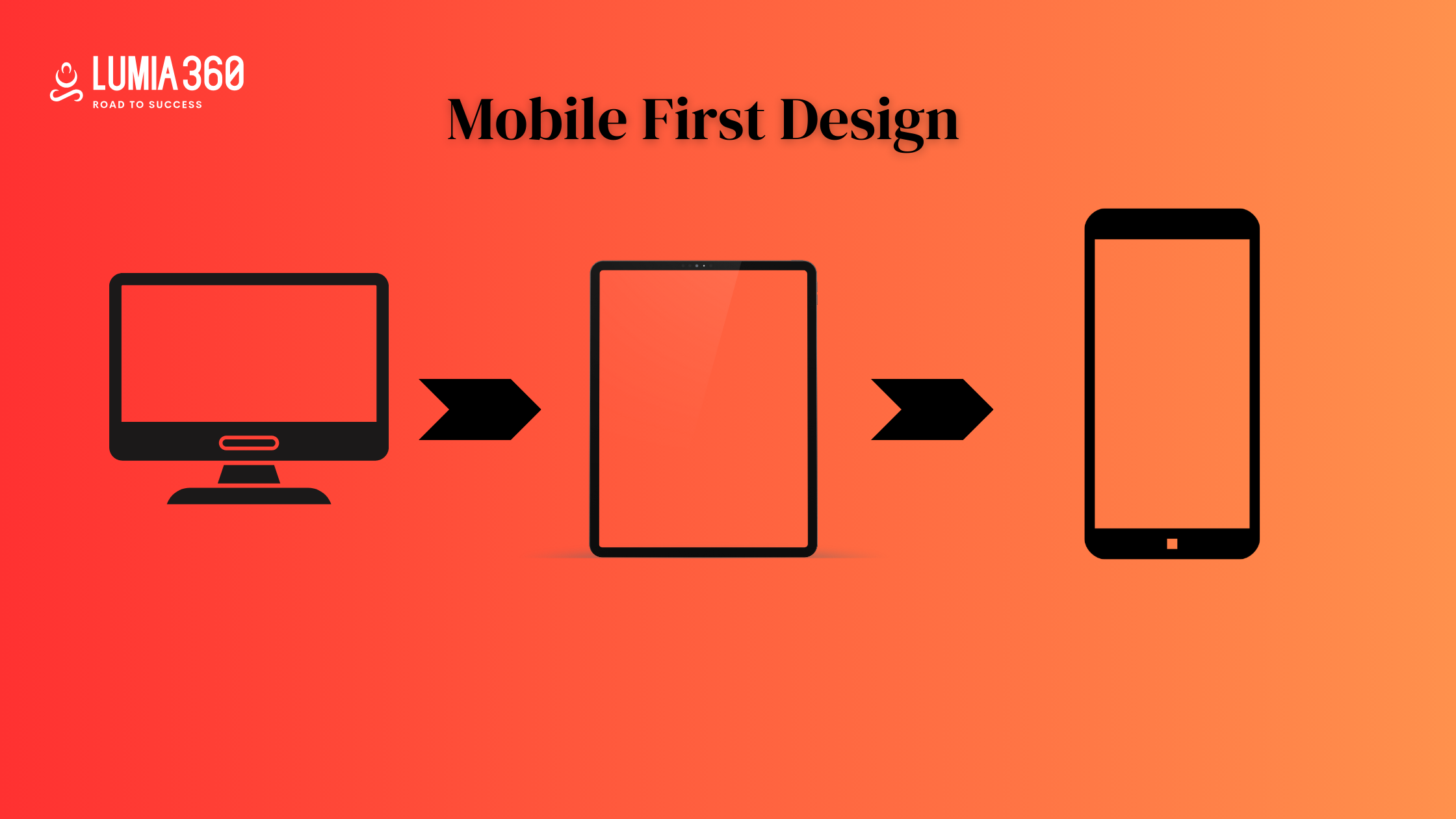
Ensure your website is responsive so that it fits all screen sizes. A responsive website enhances accessibility as it provides an opportunity for the user to access the website from any device.
You can add images and videos to your website to enhance the user experience of those who are not comfortable with reading texts. Media elements such as images, audio files, etc help in a better understanding of the content. But make sure you add the alt text and transcript for videos so that everyone can understand it.
Ensure that all the interactive buttons such as buttons and links are easily identified. Use different colors, styles, and effects to make sure all the elements are easily recognized by the users. Also, they can access it without much effort.
Select a good readable font that is readable to all and use sufficient space between different texts to distinguish one from another. A consistent and clear typography improves readability and ensures that users can easily navigate and comprehend the information. With the help of different font sizes and styles, you can create a visual hierarchy.
You can include symbols in your content to highlight important information. It is a very effective strategy for people with color blindness who find it difficult to distinguish between colors. Symbols ensure that the information is consumed by everyone.
Maintain a good loading speed of the website. A good loading speed ensures a smooth experience for users.
Add Alt text for images so that users with visual impairments or using older browsers can access the information. Add captions and transcript for video content, so that everyone can access the information. Sometimes you are stuck in a room where you can’t use audio, in this situation you can read the captions and transcript to understand the information.
Tips to Enhance Accessibility in Web Design
Here are some of the tips to enhance the accessibility of your website. The enhanced accessibility will boost your conversion and engagement rate along with ensuring equal access to use, enhanced usability, and user experience.
- Include inclusive design elements and accessibility standards in your website such as intuitive navigation and legible text, etc to boost engagement and conversion rate.
- Use innovation in your design to deliver the best experience to your users. Accessible design includes innovation and flexibility in user interface. This helps in delivering beyond the-screen experience to the users but a natural and context-aware experience. One perfect example of this is Apple’s VoiceOver on the iPhone, it uses the inclusive design to provide innovative solutions to everyone.
- Use Image alt text for all non-decorative images on your website and the decorative images include the alt attribute but leave it blank. The reader understands and distinguishes between images that are not necessary and can be ignored.
- Structure your content in a way so that the HTML doesn’t lose important information and structure even if the page style is removed.
- Use contrasting colors so that the information can be understood by everyone. Some websites such as HubSpot offer a toggle option so that the visitors can choose their color contrast. Such features give control to users over the experience they have with the website.
- Ensure users can access your website from the keyboard such as the tab key should users jump between selected elements on the page and the space or enter key should select that particular element, etc.
- Avoid using content that blinks or flashes. According to the W3C, content that links or flashes more than three times in a second can trigger seizures. It’s best to avoid such practices.
- Don’t set a timer for the users. If an action on your website includes a time limitation, try to remove it. Similarly, if a user disengages with the drop-down menu from the mouse, the menu disappears. This disrupts the user experience. HubSpot has a drop-down menu that doesn’t disappear immediately.
- Ensure your website has easy-to-use navigation and a clear page title, structured links, keyword focus indicator, etc to guide the user.
- Place important information and navigational links in the above the fold. Strategically structure your website to enhance user experience.
- Provide a clear description of errors and instructions to overcome such errors to the users.
- Frequently test the accessibility of the website and update it with new technologies and standards.
Creating an accessible website is important for ensuring that every user has equal access to the website. By following best practices and using tools and software can make your website more accessible, user-friendly, and inclusive. Always remember to comply with accessibility standards. These practices ensure an overall smooth and enhanced user experience for all. Lumia 360 has a 6-step design process to ensure that our websites are responsive, authentic, and accessible. We cater to small and medium enterprises because we understand their special needs and demands. Click now to learn more about our services and get a 14-day free trial.
Read Also: Overcome The Common Challenges Of Conversion Rate
Read Also: How To Create An Efficient CTA


