We all have heard the phrase, First impression is the last impression. For many users, our landing page is the first impression of our brand. It is the first time they visit or learn about us. In this competitive landscape, all websites are aiming for attention, engagement, and conversion.
If your landing page is attractive, user-friendly, and engaging then it increases the chance of conversion. It is assumed that 65% of B2B buyers self-navigate the entire process of buying, this means that your landing page should be effective in targeting these users.
In this blog, we’ll explore why landing pages are important, best practices, the process of creation, mistakes to avoid, and metrics to track the landing page. An effective landing page is very important for your brand’s success and increasing sales.
What is a landing page?
The landing page is a single web page that is designed for a particular marketing campaign and it encourages users toward a specific action. The landing page focuses on one specific action, this element makes the landing page different from the other pages of the website.
Landing pages are mostly used for generating leads. It can be linked with social media campaigns or email to convert them into a buying customer. Whenever a person clicks on the link given in an ad, email, post etc, they land on your landing page.
There are many types of landing pages such as lead generating landing page, click through landing page, squeeze landing page, Splash landing page, coming soon landing page, product page, event landing page ,etc. The landing page should include a clear call to action and should not be distracting.
Why is it important to create an engaging landing page?
Now that we have understood what landing page is, let us understand why landing page is important for your brand.
- Encourage Conversions: The landing page is dominated by one element or factor. It encourages users to fulfill that one specific action such as signing up for an email or newsletter, sell a product or gather their personal information such as email id, mobile number etc. The landing page has a specific CTA that motivates users for completing the task.
- Focus targeting: Since one landing page deals with only one factor. Thus your content or message is more targeted and specific to that goal.
- Improve customer experience (UX): They provide a comfortable experience to customers. All the information, CTA, etc are clear and easily navigated.
- Results: The results of the landing page are measurable. You can use this data to improve your services and make data driven decisions.
- Build trust & credibility: A clear and user-friendly landing page builds trust in the audience. The landing page includes all the necessary information and highlights the professionalism of the brand.
- Align content of an ad: The content of the landing page is aligned with the content of the landing page. It’s like a continuation of your social media campaign and motivates users to take necessary action for your goal fulfillment.
- Build brand identity: Landing pages establish your brand’s identity. It includes all the necessary information and highlights the values of your brand.
Best practices for landing pages
The best practices for creating an effective landing page are
- Goal: Define your goal and your desired result. Such as 20 conversions in one month etc. Have a clear and focused goal.
- Audience: Understand your target audience. Which platforms do they use the most, demographics, user behavior, preferences, interests, etc? Have a clear idea of where to stand in the conversion funnel and cater the content accordingly.
- Easy to understand: Don’t clutter your landing page with too much information. Provide only the necessary information. Make sure your landing page highlights only one message and one CTA. Create high quality content and attractive landing pages so that you can capture their attention. It should be user friendly.
- Content: Create short content with bold and engaging headlines. Make sure your content is relevant to your goal. The content should offer some solution to your users. Use simple and easy-to-understand language. Your content should evoke emotions in the users such as excitement, hurry, suspense ,etc. Consider your audience’s feedback. Tell a story through your content for better results. You can use testimonials as well for social proof.
- CTA: Use a clear and visible Call to Action button in your landing page that specifies the desired action from the users. Use strong verbs and try to evoke emotions such as get an offer, sign up etc. Try to use a 2-4 word CTA.
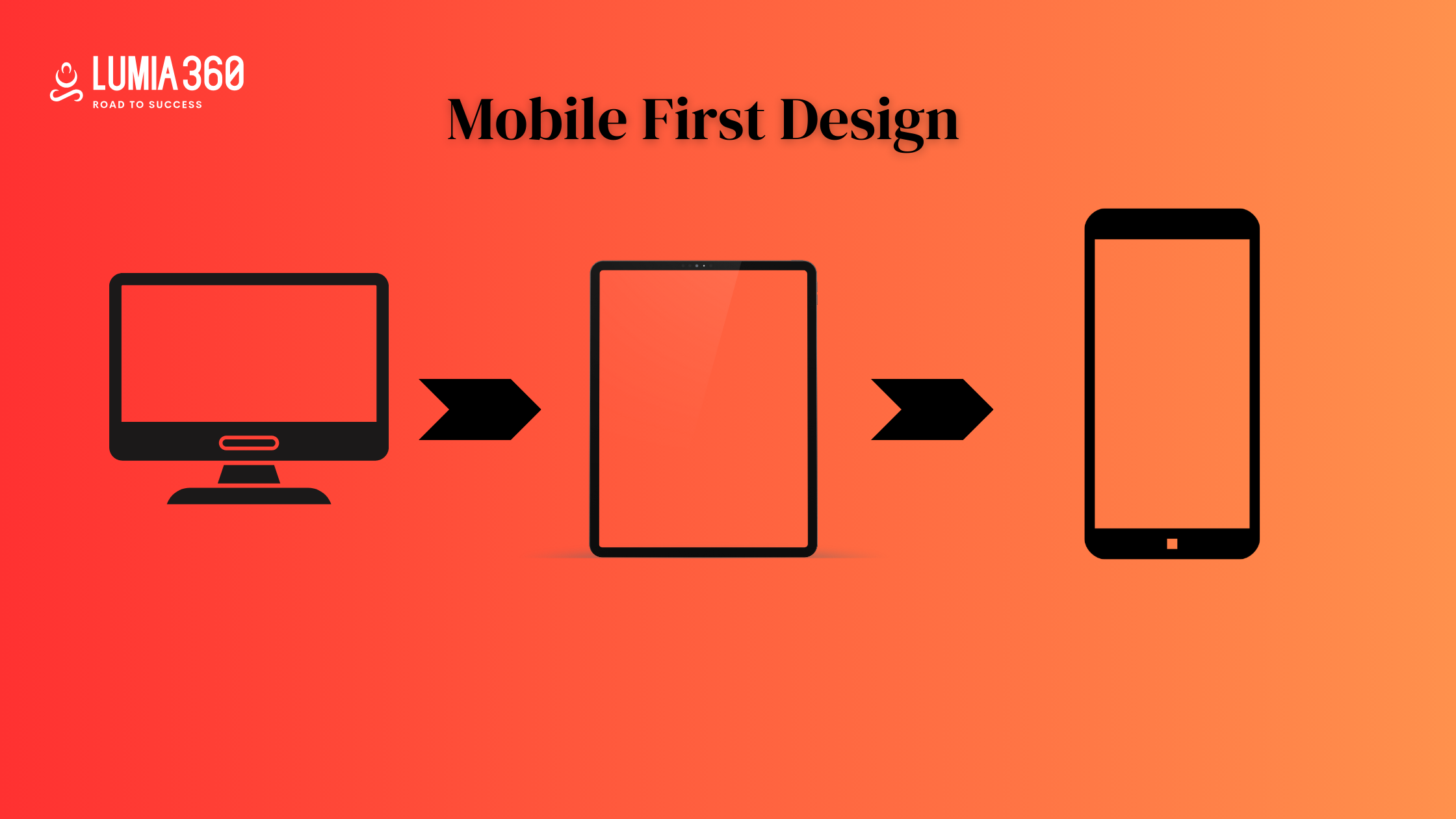
- Mobile friendly: All the elements of your landing page such as images, text, CTA etc should be optimized for mobile. Use thumb based navigation specially for cta. Reduce the redirects and make sure your page loading speed is fast. Include large touch-friendly buttons. Test across different browsers and mobiles.
- Design: Create an attractive landing page that captures the attention of the users. Use white space efficiently. Your design should be easy to read. Use colors that resonate with your brand. Make sure it is relevant to your goal. Use high-resolution images. Make sure your images are accessible to users with visual impairments, add alt text for a better understanding. Use the size and placement of the image wisely so that it captures the attention of users.
- Navigation: Keep your layout clear and simple. Avoid the unnecessary clutter so that your navigation is clear and easy to use. Make sure there is a flow or pattern in your navigation. The load speed of the landing page should be fast. Incorporate touch-friendly buttons and elements such as forms, icons, links, etc. Highlight the important element of your landing page by using a specific color of larger font size etc.
- A/b testing: conduct an a/b testing of the elements of your landing page such as content, images, CTAs, etc.
- Analysis: Measure the result of your landing page so that you can make data driven decisions and make improvements in the areas that need improvement. You can rework on your headlines, images, cta, color, font etc.
How to create a landing page
The best practices for creating an effective landing page are
- Goal: Define your goal and your desired result. Such as 20 conversions in one month etc. Have a clear and focused goal.
- Audience: Understand your target audience. Which platforms do they use the most, demographics, user behavior, preferences, interests, etc? Have a clear idea of where to stand in the conversion funnel and cater the content accordingly.
- Easy to understand: Don’t clutter your landing page with too much information. Provide only the necessary information. Make sure your landing page highlights only one message and one CTA. Create high-quality content and attractive landing pages so that you can capture their attention. It should be user-friendly.
- Content: Create short content with bold and engaging headlines. Make sure your content is relevant to your goal. The content should offer some solution to your users. Use simple and easy-to-understand language. Your content should evoke emotions in the users such as excitement, hurry, suspense, etc. Consider your audience’s feedback. Tell a story through your content for better results. You can use testimonials as well for social proof.
- CTA: Use a clear and visible Call to Action button in your landing page that specifies the desired action from the users. Use strong verbs and try to evoke emotions such as get an offer, sign up, etc. Try to use a 2-4 word CTA.
- Mobile friendly: All the elements of your landing page such as images, text, CTA etc should be optimized for mobile. Use thumb-based navigation, especially for cta. Reduce the redirects and make sure your page loading speed is fast. Include large touch-friendly buttons. Test across different browsers and mobiles.
- Design: Create an attractive landing page that captures the attention of the users. Use white space efficiently. Your design should be easy to read. Use colors that resonate with your brand. Make sure it is relevant to your goal. Use high-resolution images. Make sure your images are accessible to users with visual impairments, add alt text for a better understanding. Use the size and placement of the image wisely so that it captures the attention of users.
- Navigation: Keep your layout clear and simple. Avoid the unnecessary clutter so that your navigation is clear and easy to use. Make sure there is a flow or pattern in your navigation. The load speed of the landing page should be fast. Incorporate touch-friendly buttons and elements such as forms, icons, links, etc. Highlight the important element of your landing page by using a specific color of larger font size etc.
- A/b testing: conduct an a/b testing of the elements of your landing page such as content, images, CTAs, etc.
- Analysis: Measure the result of your landing page so that you can make data driven decisions and make improvements in the areas that need improvement. You can rework on your headlines, images, cta, color, font etc.
Mistakes to avoid
Here are some of the mistakes that we should avoid
- Don’t overload your landing page: Avoid unnecessary elements in your landing page. Don’t make it distractive for the users. Make sure you highlight important information.
- Ineffective Call To Action: Avoid generic or boring CTA. Your CTA should be engaging and evoke excitement in your users.
- Slow speed: Slow page loading speed is the biggest reason for the failure of your landing page. People nowadays don’t have patience and don’t like to wait. So make sure your loading speed is fast.
- Lack of mobile optimization: Nowadays users mostly use mobile phones for making searches or making purchases. So make sure all your elements are well-optimized for the small screen.
- Insufficient testing: Lack of testing or analysis can also hamper your results. Test different elements such as visuals, headlines, CTA, font size, content ,etc. Use different metrics to track the performance of your landing page and identify the areas of improvement.
Metric to track landing page
- Click Through Rate (CTR)
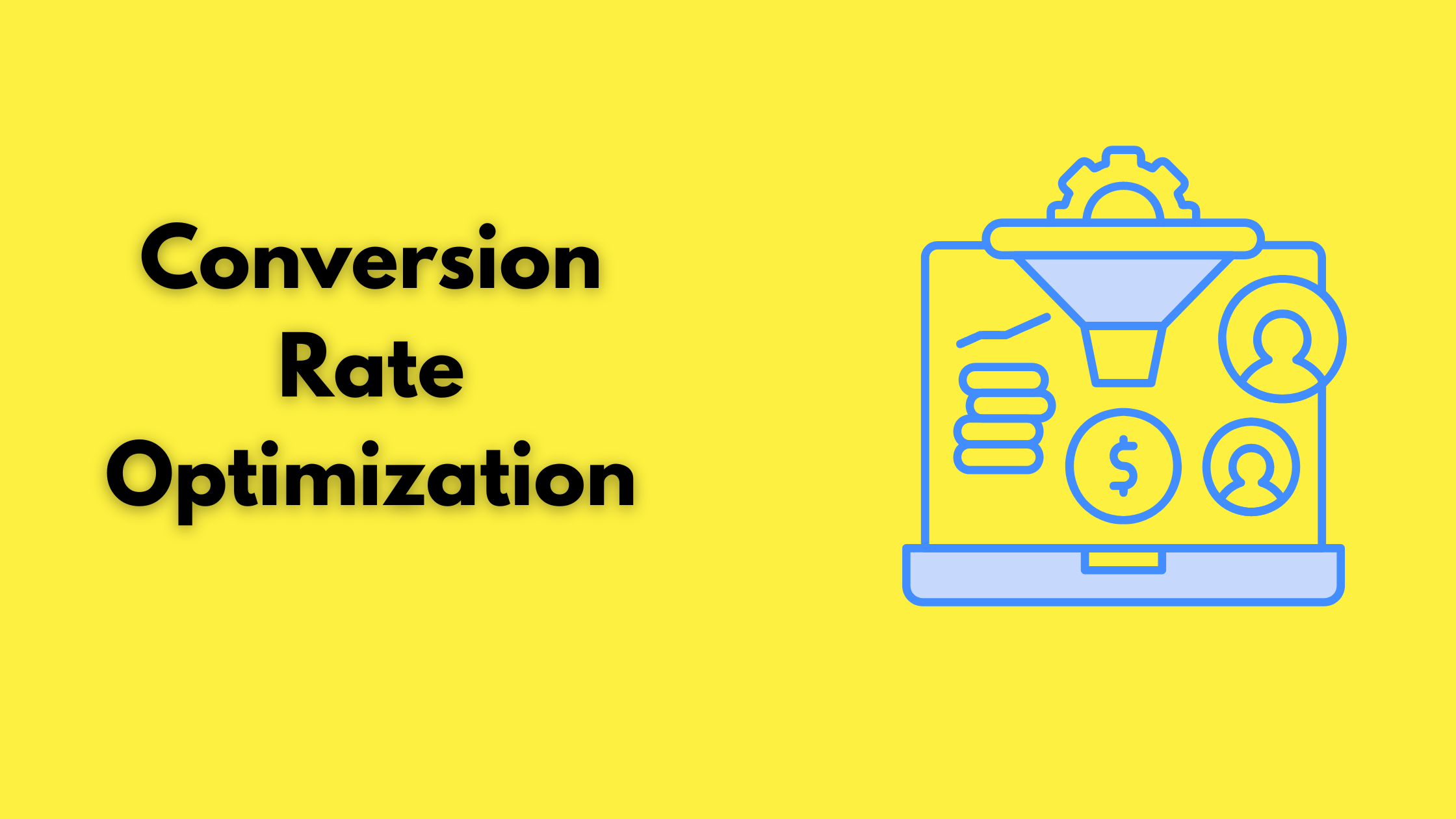
- Conversion Rate
- Bounce Rate
- Exit Rate
- Average time on page
Conclusion
Now that we have understood what landing page and why it is important for our brand. We should create an effective strategy for generating a landing page and use the above mentioned best practices for best results. Make sure your landing page is clean, simple, and easy to use. Use engaging and relevant headlines, CTA, and images. Optimize your page loading speed and create a responsive design. Keep your navigation simple and include interactive buttons for a better user experience.
Are you still lost? We at Lumia 360 are here to help you. To know more about our services email us at info@lumia360.com or call us at 514-668-5599.
Read Also: The Role of Animation and Interaction Design in Modern Websites
Read Also: Conversion Rate Optimization (CRO) Tactics for Better Results

























1 Comment
[…] Read Also: Creating Engaging Landing Pages […]