
You must have heard the phrase First Impression is the last impression, Similarly whenever a user lands on your website they judge your website in the first few minutes. They notice every minute detail of your website from color to content to typography etc. From The headlines that grab attention, to the body of content that keeps them engaged, typography plays an important role in your web design and content marketing strategy.
In this blog, we’ll explore the role and impact of typography in web design, the Challenges of typography and solutions to that, and much more.
What is typography?
Generally, 90% of the website consists of a typography. It helps the users grasp information, access the product and services, etc. It refers to the art of arranging letters and texts in a way that ensures the copy is legible and visually attractive. Typography gives life to your webpage.
It includes font color, style, structure, etc to invoke a sense of emotion in the customers and convey your brand’s voice.
With the improvement in technology, designers have a vast choice between types of fonts, colors, styles, effects, alignment, etc.
Challenges of typography
- Cross-browser compatibility
- Responsive design
- Loading Page
- Accessibility
- Font Licensing
- Localization
- Performance optimization
- Consistency across devices
- Screen size & resolution
- Screen calibration
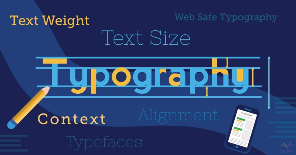
How to choose the right typography for your website
How your audience engages with your content depends on the type of typography you have used. Have you noticed that some websites give you a headache after reading a few lines while some are easy to read? This depends on the type of typography you have used.
Typography indicates how the audience perceives and engages with your content. Thus it is important to choose the right typography for your website. If your typography is correct chances are that your website will perform better and your content will be more engaging.
Here are a few things that you should consider while choosing a typography
- Typographic Hierarchy: Use different font styles, colors, sizes, etc to create a hierarchy. For example, you can use a bigger font size for headlines and a regular font size for the body of the content. This is done to differentiate between the headline, sub-heading, and the body of content.
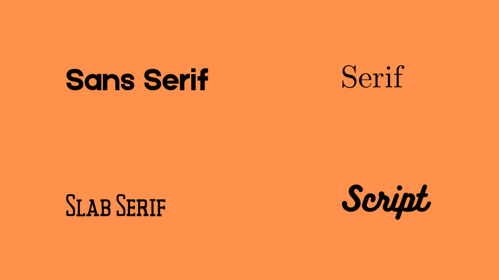
- Readability: Use fonts that are easy to read. San Serif fonts are ideal for long paragraphs. San serif fonts are easy to read on screen.
- Brand Identity: Choose a font that resonates with your brand’s tone and style. If you own a gym-related brand, use fonts like Oswald and Montserrat. Similarly, if you own a fashion brand website use Geometric sans serifs.
- Font size: Choose a font that brings a balance to your layout. Don’t use small fonts as they are difficult to read. Using a big font occupies a huge space. So make sure you choose the correct font size. You can use 16 pixels as the base font size. Also, consider the screen size of your audience while choosing a font size
- Background: Choose a color that contrasts well with the background and eases the reading.
- Web-safe fonts: All the fonts are not available on all devices. Use a web-safe font such as Helvetica, Verdana, Gill Sans, etc
- No. of fonts: Don’t use more than three fonts. Each font requires an extra HTTP request which can slow your website’s load time. In addition to that, your website lacks a symmetric design.
- Accessibility: Your chosen typography should fulfill the accessibility standards
- User feedback & stay updated: Review your user’s feedback regularly. Ask them about your font and their recommendations. Also, stay updated with the emerging trends in design and typography.
Why is typography important for web design?
According to web design statistics, 83% of online users said in a survey that they appreciate it when a website looks attractive and up to date. Here are some of how typography can enhance your website performance
- Brand Identity: Typography highlights the brand’s values, message, and identity. Consistent use of a font across various channels establishes brand identity.
- Attract readers: A good typography makes a website more attractive and readable.
- Set a tone or mood: Typography helps in setting a tone and conveying a certain feeling by using different font colors, styles, and sizes.
- Hierarchy: Use different font sizes for different headlines and the body of the text. To highlight which part is more important.
- User Experience: A correct typography strategy can enhance your user experience.
- Consistency: Use a consistent style of font
- Aesthetic appeal: Different font colors, and styles combined with background space can make your website more appealing
- Mobile responsiveness: Use a font that is readable on mobile devices easily.
Tips to improve typography
- Don’t use all capital letters
- Stay between 40-80 characters per line
- Provide sufficient space between the lines
- Minimize distractions, try to avoid flashing or disappearing text
- Don’t depend much on color for designing. Think about people with visual impairment. Make sure your website is engaging for everyone
- Consider font size & background contrast
- Use a limited amount of font
- Mobile typography, make sure your font is accessible on all devices
- Proper use of plugins
Mistakes to avoid
- Improper font selection
- Avoid using longer line width
- Using a lot of fonts
- Avoid mixing typefaces
- Overuse of decorative font
Top typography fonts
- Helvetica
- Arial
- Roboto
- Open Sans
- Times New Roman
- Futura
Typography plays an important role in web design and should be chosen carefully.
At Lumia 360 we design websites considering all the above points and much more. We create a visually attractive and engaging website.
To know more email us at Lumia Labs or call us at +1 (514) 668 – 5599
Read Also: Effective email marketing strategies for small businesses
Read Also: How Social Media Optimization Helps In Lead Generation


































































5 Comments
Your comment is awaiting moderation.
70918248
References:
Some Studies Have Found A Reduced Risk For Acne Among People Consuming
[…] Your content should be engaging and relevant. Use readable font size and style. Your content should evoke emotions like creating a sense of urgency, excitement, […]
[…] Font: Font style plays a crucial role in highlighting the important content. The headlines are usually written in larger font sizes. Similarly, font style also creates an impact in the mind of the audience. Explore the role of typography in web design. […]
[…] Read Also: Explore the role of typography in web design […]
[…] Read Also: Explore the role of typography in web design […]
[…] Read Also: Explore the role of typography in web design […]